
Opening Sequences
Crossroads was one of the few serials to concentrate much of its action at one location – a motel – and in so doing it had a chance to provide a more consistent form of branding across the whole programme, which wasn’t so easy to do in the other serials. From the opening titles down to the name badges over the years Crossroads branded not only the programme the same, but also the motel too.

The 1960s
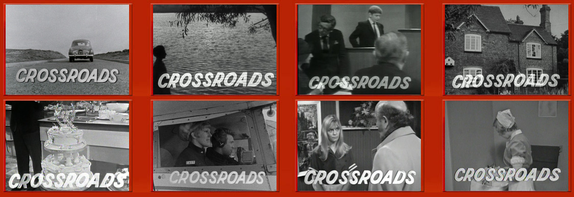
Crossroads, like many programmes of the decade, didn’t actually have any regular opening titles as such. For the first year or so the Crossroads lettering would zoom in from the centre of the screen to the bottom middle of the screen as if to be ‘a car pulling up’. This would happen over the first studio scene or over a shot of a Kings Oak location, usually the outside of the motel.
Later the zoom was dropped from the opening, and commercial break bumpers, replaced with the less dramatic Crossroads text simply fading on and off. The main opening and closing text used between 1964 and 1969 was drawn by graphics expert Rex Spencer at the time of the programme’s launch. The font, therefore, is a unique artwork only used by ATV at the time.
It was used on Crossroads promotions as well as other Midland productions such as the news show ATV Today.
The 1970s
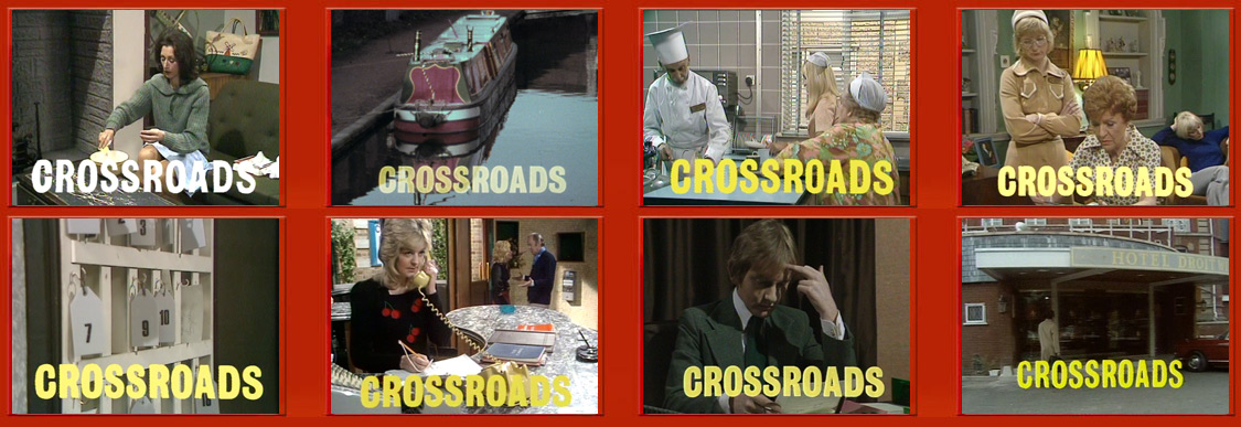
With the advent of colour television, the typeface was replaced with the format of opening the episode remaining unchanged. It was around 1969 that a bit of dual branding worked its way into the series.
The male uniforms had an oval badge, which used a similar style font for “Crossroads Motel” as the opening titles. The same typeface was also used on the motel beer mats and embossed into the menu covers of this era.
The colour for the main series typeface was yellow; exceptions were made to the closing style occasionally – notably at Christmas when other colours were used such as light blue and lilac. These festive offerings would also often be accompanied by seasonal graphics such as snowflakes or baubles.
The 1980s – Part One
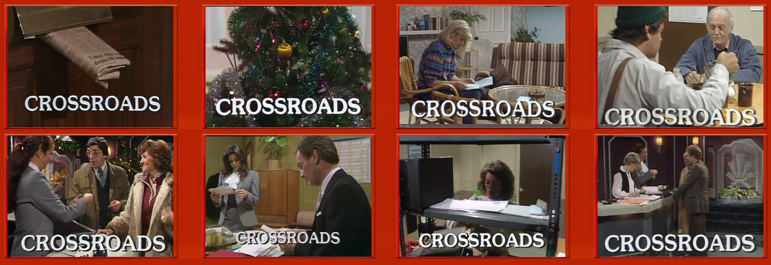
The ‘80s is the decade when universal branding seemed to become far more important to the programme. The designers oversaw the introduction of logos that appeared not only as the serials branding but also featuring as part of the actual fictional motel’s identification too.
The exterior of the motel, from 1982, became used regularly to open the series; this comprised of a number of live-action shots of the motel driveway with the ‘feather’ logo on display taken from differing angles. There were even a couple of daytime/night-time aerial views of the hospitality complex.
The opening format and theme tune however once again remained unchanged. The typeface – which had been updated in 1980 – continued to fade on and off over these fancy new shots or over the first in-studio scene.
There were tweaks in 1983 when the feather logo was changed to a more traditional crown logo that had historic links to the midlands. The shots around the Golden Valley Hotel were updated to reflect the revamped logo, the hotel also in late 1982 underwent a major refurbishment inside and out, this was also reflected in the new sequences.
The 1980s – Part Two
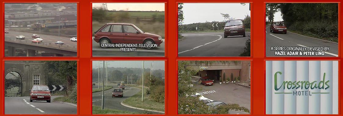
1985 saw Crossroads gain its first feature-length opening title sequence, a full 45 seconds long. It was also the first time the motel and programme had fully been branded alike. The Crossroads Motel logo for the building was exactly the same as the one featured in the opening titles.
 Again this was a hand-drawn logo. The Tony Hatch theme music was also modernised by Head of Music at Central, Johnny Patrick. The title sequence saw a red MG Maestro on its journey from Birmingham to Kings Oak. Local dealer PJ Evans provided the car to Central TV.
The titles begin with an overview shot of the A38 motorway, the long-demolished Aston ASDA supermarket can be seen in the background. Various road shots appear including a turn off on Alcester Road, opposite the Cross and Bowling Green public house, and a bend in front of the East Gateway to Umberslade Hall.
The titles end with the car arriving at the Crossroads Motel, which in real life is Penns Hall – now Ramada Sutton Coldfield.
The 1980s – Part Three
In early 1987 the end of the titles was reworked to say Crossroads Kings Oak. This was part of the ongoing modernisation of the programme with the eventual loss of the Crossroads Motel.
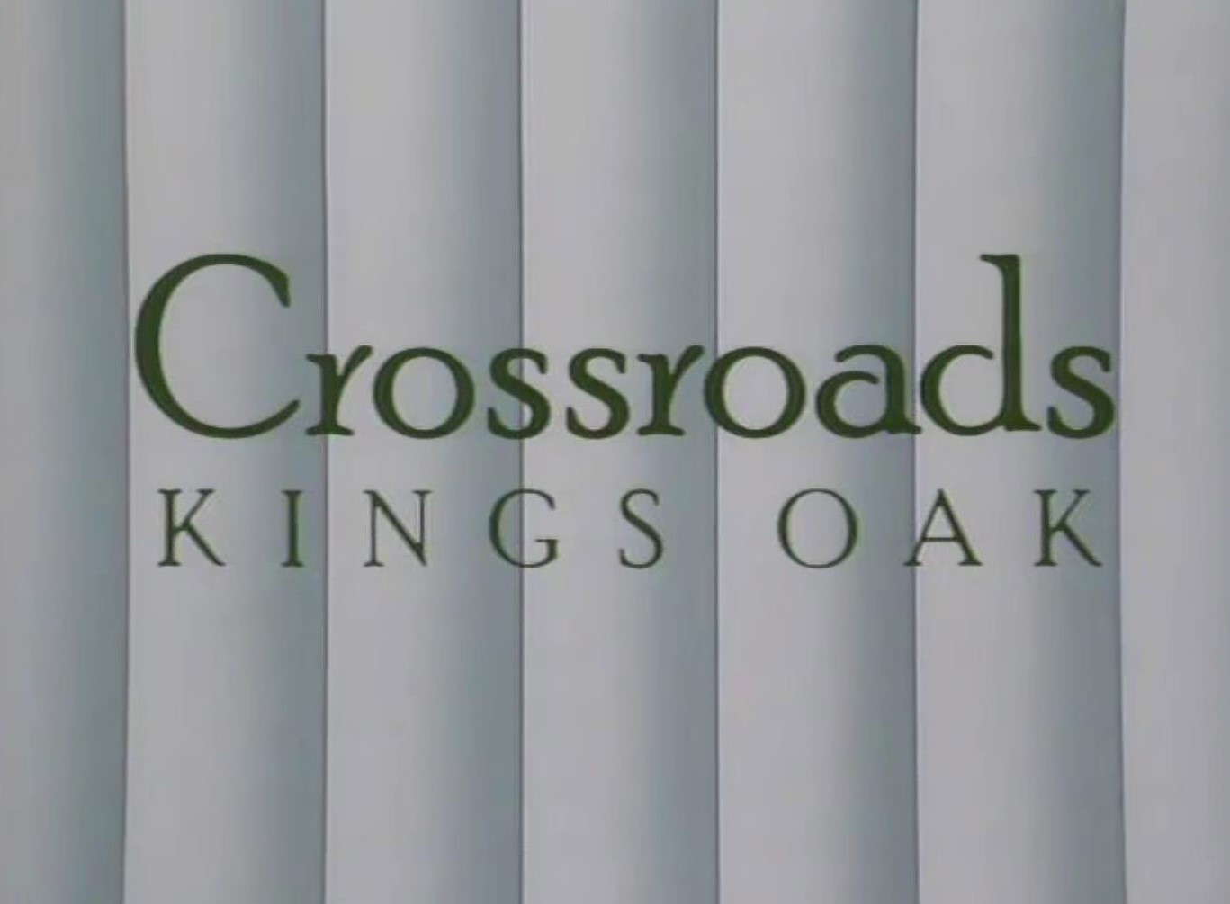 First, the storyline introduced the Crossroads Country Hotel and then finally The Kings Oak Country Hotel. The Johnny Patrick version of the theme music was also tweaked to coincide with the change from Crossroads Motel to the new branding. The biggest revamp in the show’s history came in September 1987 when a whole new set of titles were introduced – with a brand new theme tune.
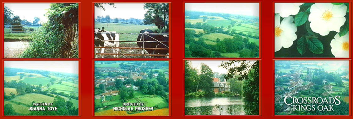
This opening sequence was filmed mainly from above the village of Tanworth-in-Arden, which had doubled as Kings Oak since 1970. The surrounding Warwickshire countryside also featured in shots. Most people describe the ‘87 titles as “very Emmerdale Farm” – although actually, these pre-date the similar Emmerdale style titles by two years.
The idea was to rename the series ‘Kings Oak‘ in 1989 with all references to Crossroads confined to history. However, before the titles had even aired Central pulled the plug on Crossroads two months earlier in the summer of ‘87.
The 2000s – Part One
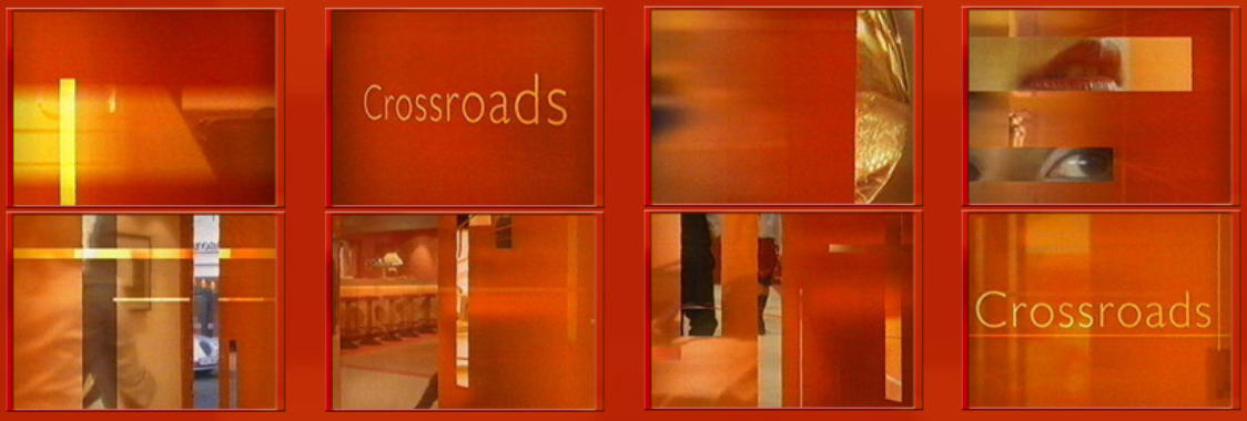
 In 2000 Carlton, the company which had bought up Central Television decided to re-launch a new version of Crossroads to fill the teatime slot left by Home and Away which had switched to Channel 5.
The revamped Crossroads Hotel was a corporate complex from building to titles. The entire lot was branded together, with glossy orange effect graphics showing random parts of the hotel and its staff.
The production also saw the return of the Tony Hatch theme, all be it a re-recording by Tony Flynn, which proved popular with fans.
The 2000s – Part Two
While a lot of people in television circles lampoon Carlton Television for being of little substance the company proved with the first reboot of Crossroads they could deliver a glossy strong brand and sophisticated image with Crossroads.
Unfortunately according to some Carlton staff Crossroads didn’t sit well with the network HQ. Insiders suggest the closure of Central Television and Carlton Productions was behind the ‘decision to remove Crossroads from the schedules’ – along with, by coincidence, pretty much everything else made at the Carlton Studios in Nottingham.
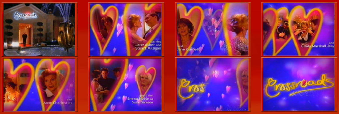
In 2003 Crossroads underwent its unneeded re-brand, which managed to take it from the most-watched daytime programme on the network to the worst rating programme on terrestrial television. If the ‘camp revamp’ was designed to close the production centre then it worked.
All the effort put into the production previously by Carlton giving Crossroads a successful image and status was undone within 20 seconds of the new titles airing. The Tony Hatch theme was once more reworked while the graphics looked like something more suitable for Children’s BBC. The logo was a hand-drawn design with the whole sequence based around hearts, maybe the visual department creating them thought they were for Blind Date…
Typefaces
 A quick rundown of the typefaces used on the opening titles across the years. The first from 1964 to 1969 is a unique hand-drawn logo as-is, we believe, the 1985-1986 version.
The 2003 logo is also a special creation for the series. The 1969-1980 typeface is called Grotesque. The 1980-1984 font is entitled Boulevard. From 1986 to 1988 the logo used Poor Richard for its text creation while the 2001-2002 typeface is entitled Humanst521.
Break Stings
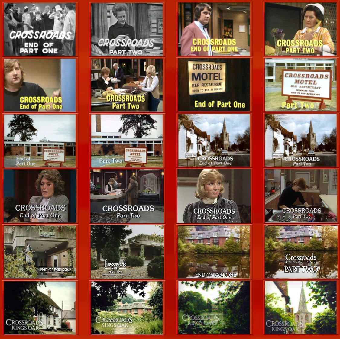
For most of the 1960s, 70s and early 1980s, the End Of Part One and Part Two text was simply overlaid onto the last or first scene of that part of the show. By the mid-1980s regular, more artistic, break bumpers were devised. The new version of Crossroads isn’t included here as that production re-used segments of the main opening titles into and from the commercial breaks
The things you don’t usually see..
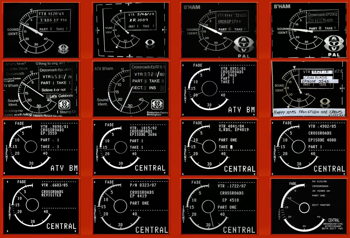
Here we have a selection of what is known as the ‘VT Clocks’ the device used to identify which episode is being produced, aired and then archived. This selection ranges from the earliest of the 1960s through to the very last episode in 1988. There’s also the Video Tape Clock for ‘Crossroads Revisited‘ the 1985 documentary on the saga and for ‘Crossroads 30 Years On‘ from 1994.
| Researched by Doug Lambert, Tom Dearnley-Davidson and Mike Garrett. Images (C) ITV Archive/ATV/Central Television 1968-1994. |
