

Crossroads was one of the few soap operas to mainly concentrate its action on one location – a motel – and in so doing it had a chance to provide a more consistent form of branding across the whole programme, which wasn’t so easy to do in other serials.
 From the opening titles down to the name badges over the years Crossroads branded not only the programme the same, but also the motel too. A case of fact blurring into fiction…
The original motel sign didn’t include a bar open to non-residents as the storyline saw Meg without a liquor licence for the first few weeks. The more famous ‘red and white’ motel signage arrived later once the bar and other amenities were fully opened at the motel.
Exteriors and Signs
The original Motel was designed in 1961 and began construction later that year. The complex opened in April 1963.
Crossroads Motel opened in the grounds of the Richardson family home after the death of Charles, husband of Meg and father to Sandy and Jill. A motorway had been built over part of the family land and with the compensation money, the new accommodation area was added onto the mansion house.
The original motel comprised of only sixteen chalets. These all came with their own garage to park the traveller’s car. As with all serials at that time the majority of the ‘exteriors’ for this period were actually inside the TV studios, as some of the photos we have been able to source show.
The outside shots were recorded at Walford Hall in Baschurch, Shropshire, for the main motel frontage and house, with chalet shots recorded at the Longshoot Motel in Nuneaton.
Crossroads Motel Establishing Shots
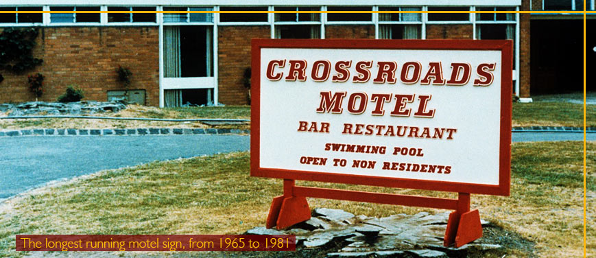
We expect the ‘red and white’ signage is the most remembered – which although looks like its made of wood, is actually mainly made of metal – and was bought by Kathleen Hudson for the Crossroads Appreciation Society in 1988.
It is a reworking of the original 1964 signage which didn’t note any of the amenities at the Crossroads Motel other than the car park and the reception. (with thanks to Reg Watson for this information.)
The storyline later allowed for a public bar and restaurant. The original version of the sign was Black and grey, which matched other motel signs around the grounds. This sign was the longest-lasting, including its early 1965 revamp, running from 1964 to 1981.
It often would feature in the opening scene of an episode, and it was also on the drawing of the motel which was pinned on the reception area notice board.
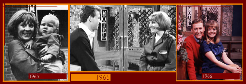
Pictured above left: One of the original ‘motel’ signs on the exterior building at Walford Hall, Shropshire, can just be seen in the background. Actress Alex Marshall as waitress Christine Fuller features. Pictured above middle: a scene from Crossroads with the motel sign behind the action.
Pictured above Right: the same sign is used in the Aston Studio’s set of the Crossroads Motel foyer with Vincent Ball and Susan Hanson as Kevin McArthur and Diane Lawton.
Uniforms
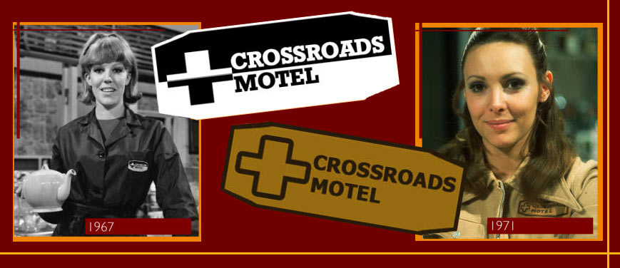
To begin with, the programme look did not correspond to the look of the Crossroads Motel. The logos for the ‘complex’ had a totally different style to the soap opera branding. The uniforms changed quite often, especially the female staff, however some badges were long-lasting…
The rebuilt Motel 1968
Disaster struck the Crossroads Motel when a wartime bomb blew the reception area, kitchen and offices to bits in the summer of ‘67.
The WWII explosive had been left undiscovered for nearly 20 years when workmen unearthed it while extending the motel accommodation. The area was evacuated, however, a digger broke free, rolled over the bomb and set it off. Cook Betty Cornett (Sheila Keith) was killed while secretary Julie Shepherd (Jean Rogers) was trapped under the reception desk.
After the rebuilding work was complete the new look Crossroads Motel took on a more traditional style. The modern 1960s fittings and fixtures of the original motel gave way to a more “old fashioned” style in keeping with the Georgian House that the motel was attached to.
Pictured above: While many scenes were shot at Walford Hall over the years, sadly only one short film clip of the sign at the exterior location survives.
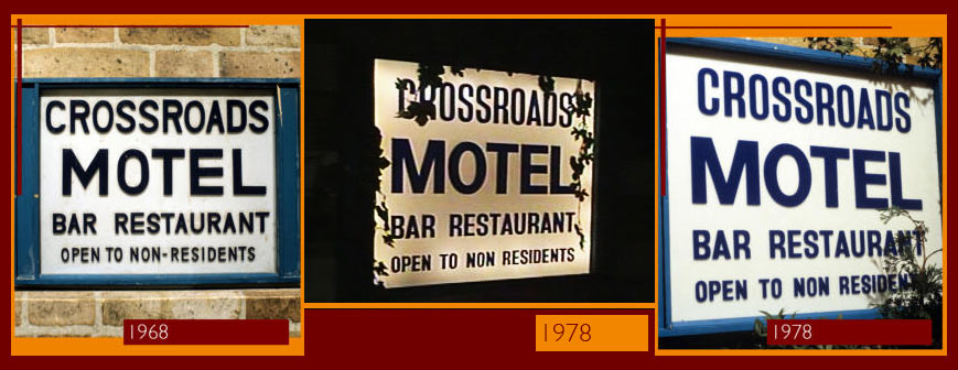
The Blue Motel Sign
 Not as “famous” as the red motel sign, which is strange – as it was seen far more often! This was situated directly outside the motel entrance in the reception set. It arrived in 1968 with the new foyer set and was replaced in the mid-1970s.
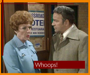
This new version saw only slight changes which kept the same layout and colours. It is noted for when it was first introduced it suffered an embarrassing ‘typo’ with the Restaurant lettering spelt as Restuarant. It survived a few episodes before being corrected.
This later sign was burned to ashes in the 1981 motel inferno.
Pictured right: The Crossroads Motel sign in 1975 with its misspelt version of the restaurant wording. Whoops!
The Decade of Motel Changes
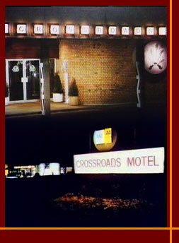 In 1981 the Crossroads Motel burned to the ground. The old house escaped the inferno, however, the 1960s buildings were gutted. This led to a whole new look for the motel. But it wasn’t to last all that long before more changes were made.
The motel directly after the fire had a new look exterior – but this somehow didn’t look “new” – the building seemed far older than a 1981-1982 supposedly rebuilt motel! From now on ATV no longer used in-studio sets for exterior shots, all outdoor scenes were filmed at the real outside location of the Golden Valley Hotel. (pictured left)
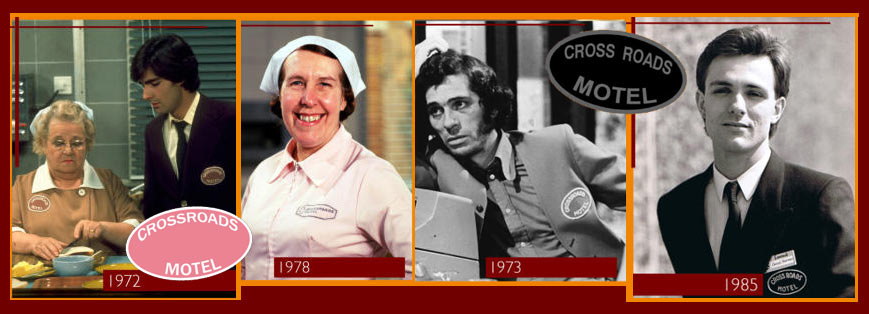
Pictured above left: The oval logo, mainly seen on the male bar and waiting staff jackets, made it onto one version of the female kitchen staff uniform briefly, both illustrated by Ann George as Amy Turtle and Mark Colleano as Simon Whitaker. It was also used on a waistcoat which female receptionists could opt to wear, although not used often by many. Second Left: The emblem created in 1964 survived into the 1980s in varying colours. Pictured on the kitchen uniform of Doris Luke, played by Kathy Staff.
Next: Albert Shepherd as barman Don Rogers shows his 1970s uniform. This, used for male bar staff and waiters, lasted until 1984. The typeface used for this logo was Franklin Gothic. And, finally, above right, even after new uniforms were introduced in 1985 the same style oval logo was used on the male staff jackets right until the series ended. Philip Goodhew as Daniel Freeman shows this version.
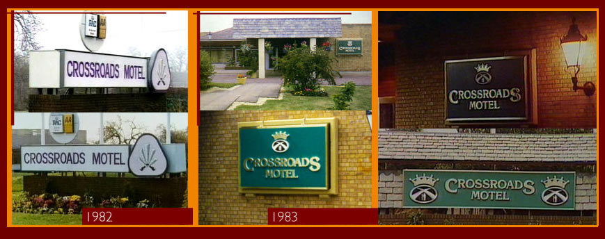
From a Feather to a Crown
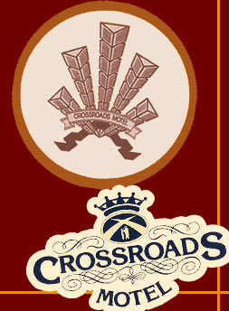 The feathered logo was introduced in 1982 but wasn’t to last long. It was actually the Golden Valley’s logo – slightly adapted – but the TV regulator viewed it as ‘advertising the Golden Valley’ so a new fictional branding had to be devised. The crown arrived in 1983 and was used as the main motel logo until 1985, it even survived two further revamps as a secondary logo until the programme’s demise in 1988.
The Crown symbol used over this period was actually the most ‘Midland’ related of all the logos with the central image of a bear and ragged staff being part of the Warwickshire County Council logo. The bear and the ragged staff were first used by the Beauchamp family, who became earls of Warwick in 1268, as a badge or mark of identity into addition to their own coat of arms. At first, the emblems seem to have been used independently.
The bear alone appears on the tomb of Thomas Beauchamp I (died 1369), in the chancel of St Mary’s Church in Warwick. Robert Dudley, Earl of Leicester, a favourite of Queen Elizabeth I, and great-great-great-great- grandson of Richard Beauchamp, is known to have used the combined device of the bear and ragged staff frequently. It can be seen in many places on the walls of the Leicester Hospital in Warwick, which he founded in 1571, and on a chimneypiece in his castle of Kenilworth.
This crest has been used by the earls of Warwick to the present day, but over the centuries has also come to be associated with the county. Thus the 1st Warwickshire Militia regiment (originally raised in 1759, but reorganised under the Earl of Warwick as Lord Lieutenant in 1803) bore the bear and ragged staff as its collar badge until attached to the Royal Warwickshire Regiment in 1881. The Warwickshire Constabulary (founded in 1857) also adopted the bear and ragged staff as their badge. Warwickshire County Council (formed in 1889) obtained the permission of the Earl of Warwick to adopt the bear and ragged staff for their common seal in 1907, and many other organisations have since followed this lead.
Further Changes
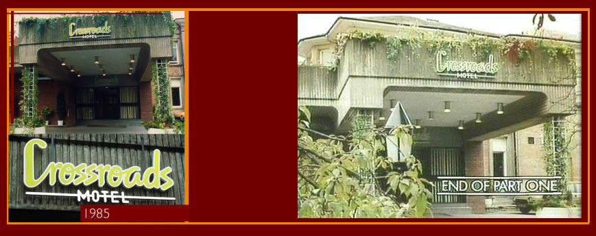
 In 1985 more rebuilding work took place at the Crossroads Motel. A hotel-style block with internal guest rooms rather than chalets was added to the complex – with a number of the 50 chalets, many dating back to the original 60s building, being demolished to make the motel more ‘hotel-like’.
The new accommodation for motel guests would be part of the building, with rooms built above the reception area. The old reception area was demolished, and the new entrance to Crossroads moved from the Eastside back to the Westside, where the original entrance had been before the fire. In the series, interior sets were totally changed to match the move from Golden Valley to Penns Hall Hotel.
Despite the ‘85 changes, the former crown logo lived on across some internal branding such as menus, wall signs and badges. The show re-brand also introduced a new logo; this was also used as the main signage on the exterior, uniting properly for the first time the motel brand with the programme itself. The green and white logo remained in use until late 1987 when finally Crossroads became a hotel.
 The Crossroads Country Hotel and Kings Oak Country Hotel signs were also based on the main Crossroads title typeface – Poor Richard.
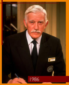
Pictured above left: The oval badge sits alongside the name badge; the latter of which also features the Crossroads Crown logo and the 1985 typeface. The image shows Head Receptionist Thomas Darby, played by Patrick Jordan.
| Researched by Mike Garrett, Doug Lambert, Tom Dearnley-Davidson and Alex Loveless. With thanks to John Drury for additional information and the ‘whoops’ image. |
